Hybrid Expression Branding

Case Study

The redesign of the Hybrid Expression branding and new website came about after critically assessing our position as a design studio. The assessment brought to light a few important factors to be addressed in order for us to align our values with the studio and differentiate ourselves from the competition.

Through discovery the impression was that Joe, the Managing Director, worked as a freelancer purely due to the origins of Hybrid Expression. The team behind him who developed unique brand expressions were little known. While Joe was happy to take credit for the work, it was due time to showcase the breadth of skills, capability and capacity of Hybrid Expression. It was also apparent that our current branding and website wasn’t communicating our professional service, collaborative and strategic approach.
...we set ourselves to work on the creative, including logo redesign, colour theory and online communication.
Hybrid Expression Branding

Equipped with this knowledge enabled us to review “Who is Hybrid Expression?”

So, for the development of Hybrid Expression’s new image, we underwent our own brand workshop, where an extensive research process took place which included intensive research into our positioning, proposition, competitors, values, target audience, brand personality and tone of voice. The results enabled us to develop a 1-page brand blueprint for Hybrid Expression to drive all communication.

The rebranding involved a full scope and with a clear outline of the brand positioning in place we set ourselves to work on the creative, including logo redesign, colour theory and online communication.
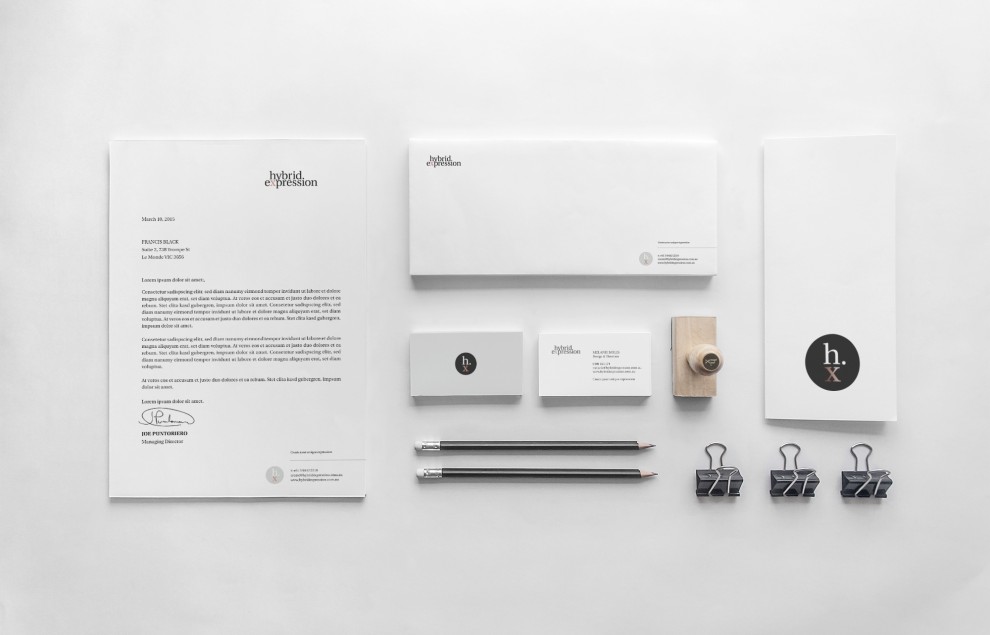
The studio’s primary brand identity is a typographic mark. The use of lowercase lettering gives the identity an approachable feel and is more conversational, reflecting the collaborative nature of our studio.

A secondary mark was created to support and represent our studio's brand for various applications.

The use of the period after the wording ‘Hybrid’, creates a definite separation between ‘Hybrid’ meaning the combination of two different elements (Print & Online, Strategy & Design, Melanie & Joe) and ‘Expression’ which forms the brand statement that says “Create your unique brand expression”, The wording ‘Expression’ then becomes a stand alone proposition that really outlines what Hybrid delivers. Visual expression, digital expression, creative expression, powerful expression, persuasive expression.

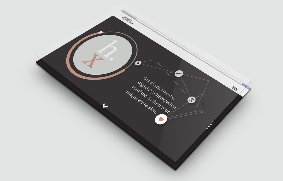
A secondary mark was created to support and represent our studio’s brand for various applications. This is represented by the abbreviation hx. and by creating this acronym for Hybrid Expression, it further supports the primary mark and works as a standalone element, which will become a memorable element associated with the studio.

The colour evolved from a bright & young palette to one that represents professionalism & expertise, with the introduction of neutrals accented with a burst of copper. This attributes to the values of the brand which is professional, result focused, expert, strategic and reliable.

Our brand strategy has been carried through all print and online communications to ensure a consistent brand story.

‘Create your unique Expression’.

back to articles
line line line
line line line

Contact.

  • This field is for validation purposes and should be left unchanged.
0414 694 855 create@hybridexpression.com.au