Corpus Medicorum 2015 Season
Corpus Medicorum
Music that heals
A Melbourne based orchestra of doctors, medical students and health professionals Corpus Medicorum truly believe in the power of music to heal their patients.
Deliverables
- Brand Strategy
- Email Marketing
- Website Design
- Theatre Backlit Posters
- Sponsorship Brochure
- Concert Program

Brief
These talented individuals, come together several times a year to present a much-loved concert series at Melbourne Recital Centre. All profits of Corpus Medicorum concerts are donated to the Royal Melbourne Hospital to fund medical research and patient services in lung cancer.
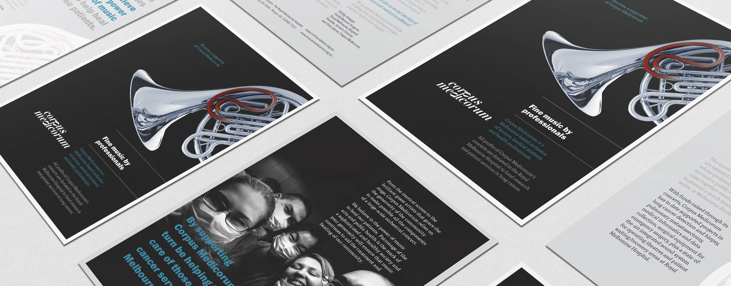
We were asked to develop a new identity for 2015, one that is identifiable to the 2015 Concert Series and can carry through the whole year across all communication, including brochures, sponsorship documents, forms, large scale banners along with additional promotional collateral.

Solution
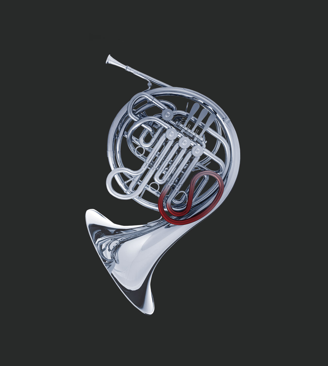
To push the language of the Corpus Medicorum brand forward, we utilised the image of a French horn with the subtle addition of the red line which signifies the correlation of music and medicine. The red line also lends itself to the theme that music runs through your veins and that Corpus Medicorum provides life support in both music and the medical profession.
The brochures embody a bold presence as we played with the relationship of a monochromatic colour scheme with periodic accents of blue. We focused heavily on typography and through the use of a precise grid, the combination of type, colour and visual elements give the piece rhythm and momentum. To emphasize the people behind the Corpus Medicorum orchestra and it’s purpose we chose images of the medical professionals which appears on the inside spread.
Testimonial
The team from Hybrid Expression does amazing work! They recently helped our orchestra construct our website plus designed all our brochures, flyers, programme notes and tickets for our recent tour to St Petersburg.Phillip Antippa Cardiothoracic Surgeon, Royal Melbourne Hospital
This work was done very efficiently and accurately - we received many positive comments from our members and audience alike about its professional style. I have since recommended Hybrid Expression to several others hoping that they will be as satisfied as I am!
Director, Corpus Medicorum

